
2022
Kansas City Southern Railroad: PowerBI Design System & Governance
Kansas City Southern Railroad's internal PowerBI ecosystem had grown organically into a disjointed collection of dashboards. Executive review sessions required juggling up to 15 different tabs, drill-down logic was inconsistent across reports, and internal "Power Users" had no shared framework for building tools that others could actually trust.
I led the research and systems design to fix this. Rather than cleaning up individual dashboards in isolation, I built a scalable design system and governance model that standardized visual hierarchy, introduced bookmark-based navigation to eliminate tab fatigue, and gave internal teams the documentation they needed to build and maintain dashboards with confidence.
Challenge
The Problem
The reporting ecosystem was creating friction at the highest levels of the organization. Data was accurate, but the experience of accessing and trusting it was broken.
- Executive tab fatigue: Senior leaders were opening 10 to 15 separate dashboards to piece together a single operations narrative each week
- Disconnected drill-down logic: High-level summaries rarely connected to granular detail, forcing users to hunt across multiple reports for a single answer
- Inconsistent standards: Dashboards used different layouts, naming conventions, and chart types, eroding trust and increasing cognitive load across teams
- No formal creation guidance: Internal dashboard creators had no visual QA process, no onboarding, and no shared documentation before publishing to the company
Objectives
Project Goals
- Streamline the executive review flow by replacing multi-tab workflows with cohesive, bookmarked navigation
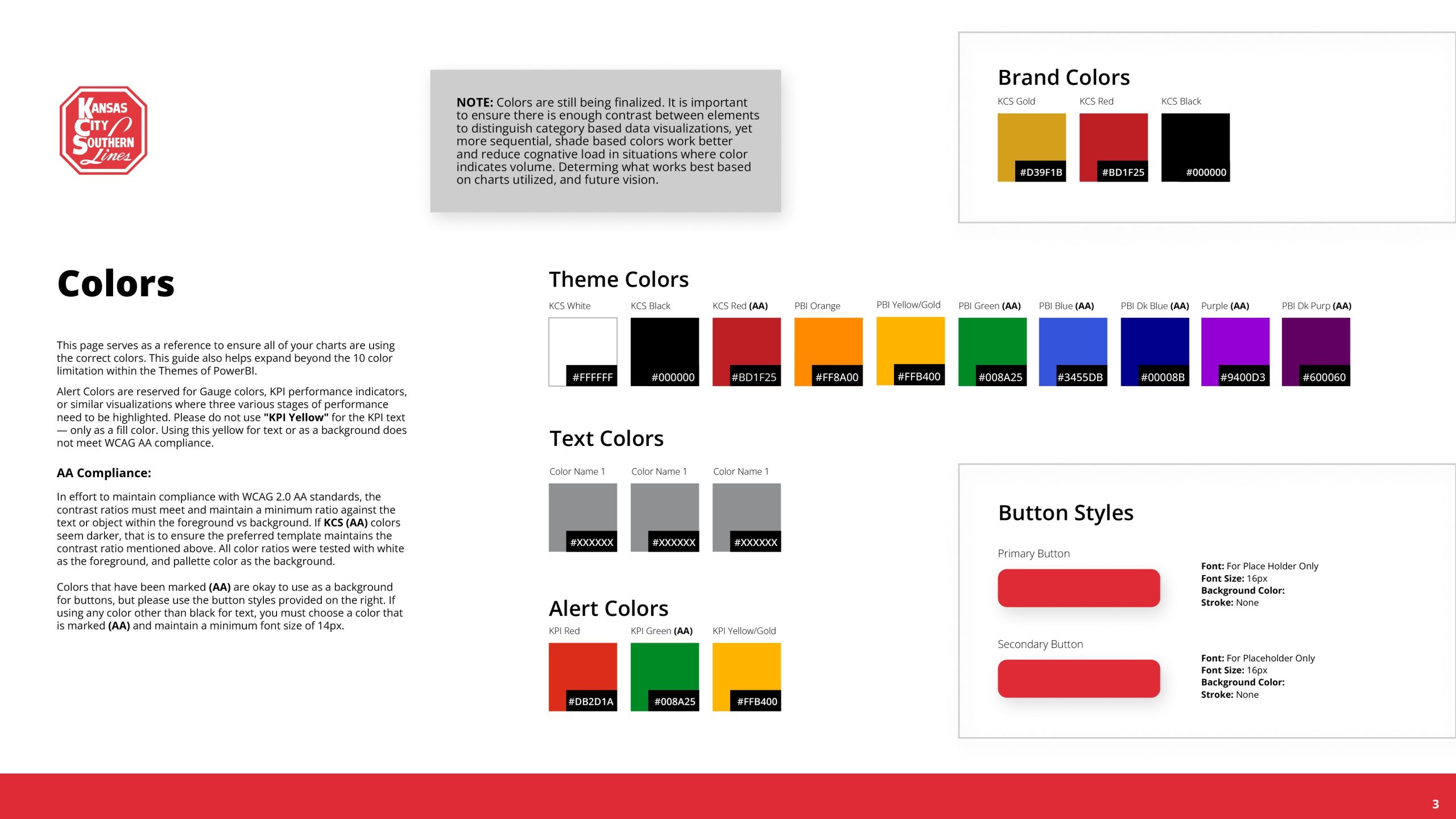
- Establish a rigorous design system covering typography, WCAG AA compliant color usage, chart guidance, and layout templates
- Design role-specific views tailored to the distinct needs of executives, analysts, and field operations staff
- Create a scalable governance model and internal documentation to empower creators and ensure long-term consistency
Selected visuals
Project Assets
PowerBI imposes strict constraints on visual customization. The design challenge here was not to make dashboards look different — it was to make them work better within the platform's native limits. That meant finding leverage through structure, information hierarchy, and navigation logic rather than aesthetics. What you see below is intentional constraint-driven design: the system doing exactly what the tool allows, organized in a way that actually serves the people using it.
Approach
Design Process
-
01 Research & Discovery
- Conducted stakeholder interviews across organizational layers: yard staff, operations analysts, and senior executives
- Mapped how each audience actually used dashboards during the critical 7 AM Monday operations review
- Surfaced a clear three-way audience split: executives needed high-level summaries, analysts needed deep drill-down, and field staff needed fast, readable tables
- Identified that the core problem was not bad data but a broken information architecture that forced users to compensate by opening more tabs
-
02 System Audit
- Audited the existing PowerBI environment for UX violations: poor tab naming, unclear filter states, redundant KPIs, and chart types that did not match the data they were representing
- Tracked visual inconsistencies across dashboard creators and teams to understand the full scope of standards drift
- Evaluated the executive review session flow to identify exactly where context switching was breaking the narrative
-
03 Template & System Design
- Built standardized PowerBI layout templates (KPI-on-top grid structures) to enforce visual hierarchy, consistent padding, and predictable filter placement
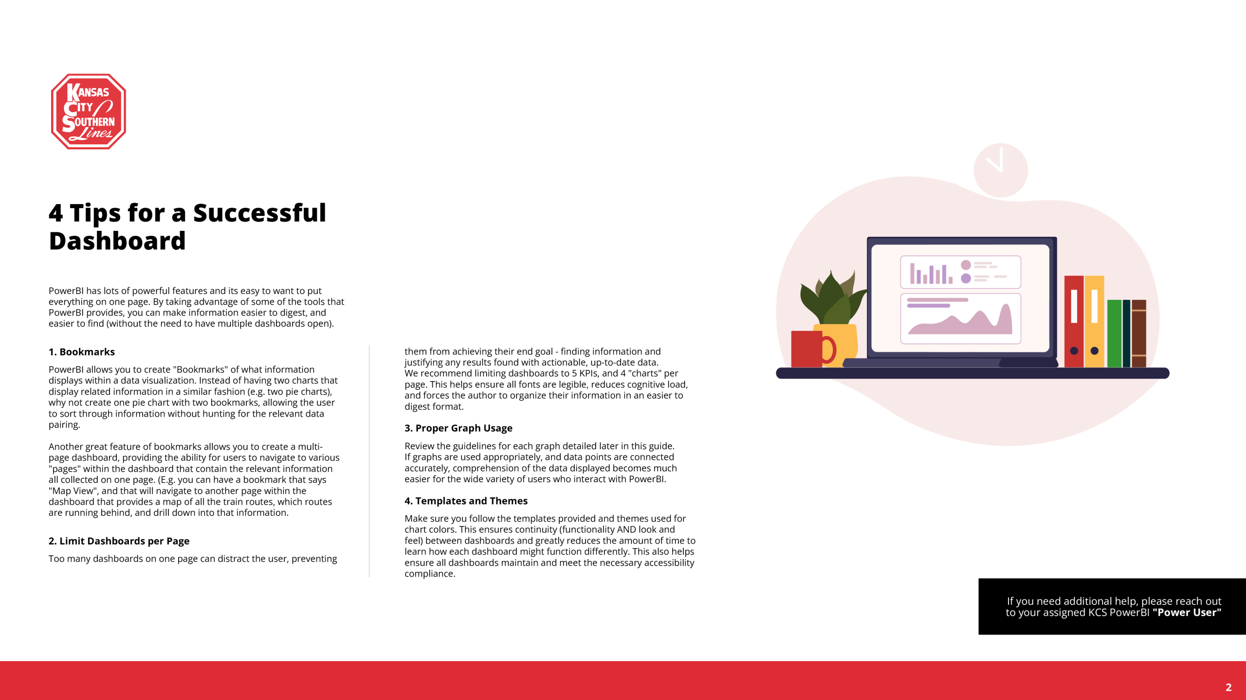
- Introduced bookmark-based navigation to consolidate related data views within a single dashboard, directly addressing the multi-tab problem raised in executive interviews
- Defined WCAG AA compliant color palettes and a two-family typography system (Segoe UI and Din) to ensure readability and accessibility across all dashboard types
- Designed role-specific view logic so the same underlying data could be surfaced appropriately for executives, analysts, and field staff without requiring separate builds
-
04 Governance & Documentation
- Authored a comprehensive PowerBI Design System Guide covering visualization best practices, naming conventions, chart selection rules, color usage, and bookmark navigation standards
- Formalized a "Power User" enablement model to decentralize dashboard ownership and give internal creators the exact parameters they needed to build without requiring constant design oversight
- Structured the guide for broad internal distribution, addressing the gap where standards existed but had never been shared outside the core BI team
Results