
2023
SSI / Website Redesign
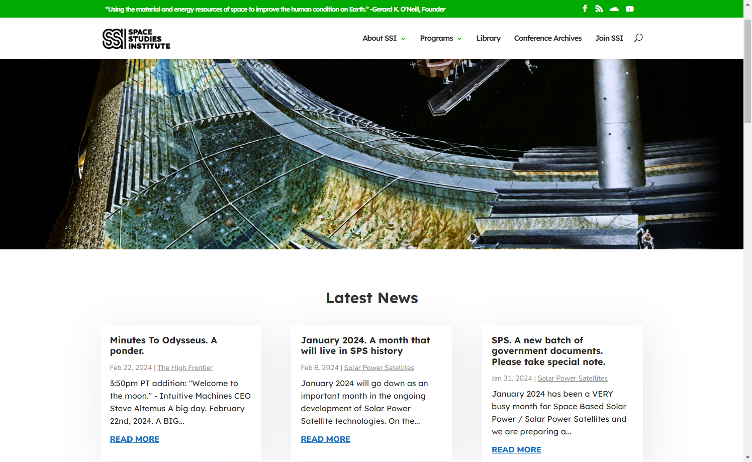
The Space Studies Institute needed a clearer digital home for a mission with deep technical roots, a rich research archive, and an audience that ranged from longtime supporters to first-time space-curious visitors.
I led the redesign around UX clarity, content structure, and long-term maintainability. The work translated a dense nonprofit site into a calmer, more intuitive experience that helped visitors understand the mission, explore research, and find meaningful paths to support.
Challenge
The Problem
The site held a lot of valuable material, but the experience needed a clearer path through it. The UX challenge was to help different audiences understand where they were, why the work mattered, and what action made sense next.
- Make technical research and organizational history easier to approach without oversimplifying the mission
- Restructure navigation around visitor intent instead of internal content sprawl
- Clarify donation pathways, impact messaging, and moments of trust across the site
- Improve readability, responsive behavior, and accessibility for an audience with varied technical comfort
Objectives
Project Goals
- Create an information hierarchy that supports donors, researchers, members, and new visitors
- Improve readability through accessible typography, clearer page structure, and responsive layouts
- Build donor confidence through mission storytelling, proof points, and visible next steps
- Give the SSI team a maintainable CMS structure they could update independently
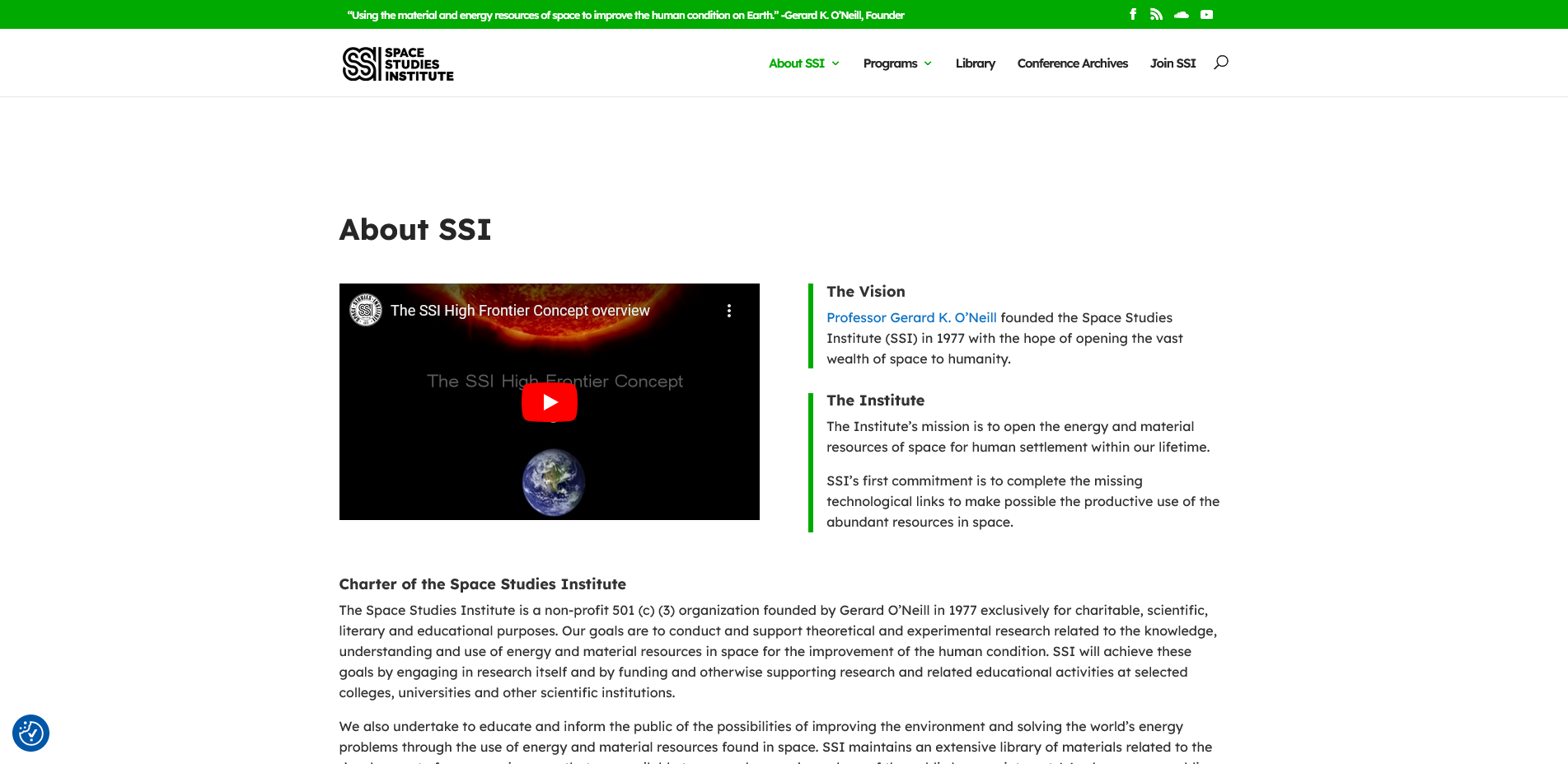
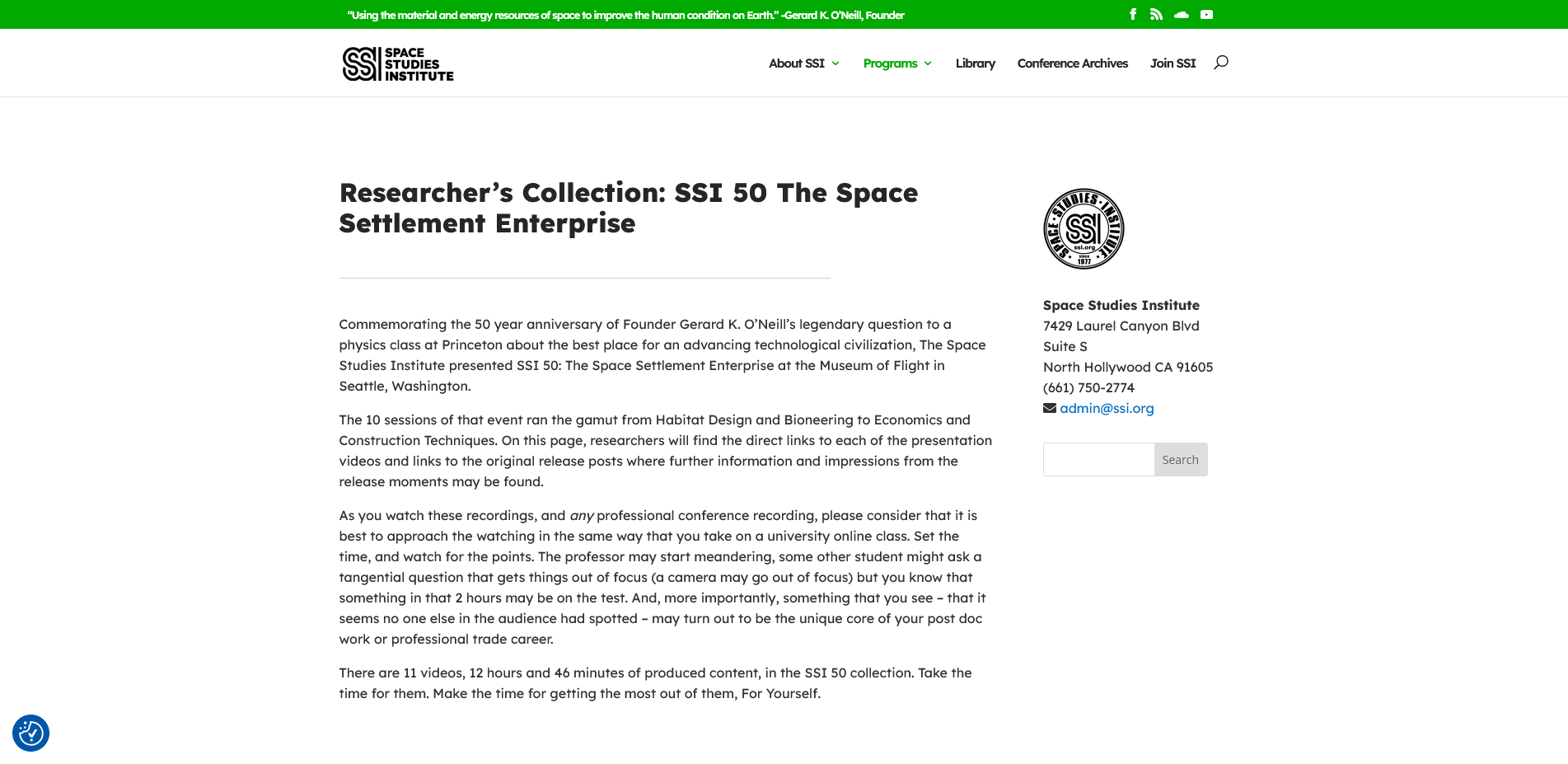
Selected visuals
Project Assets
Approach
Design Process
-
01 Research & Discovery
- Interviewed stakeholders to understand mission priorities, donor needs, and the role of the research library
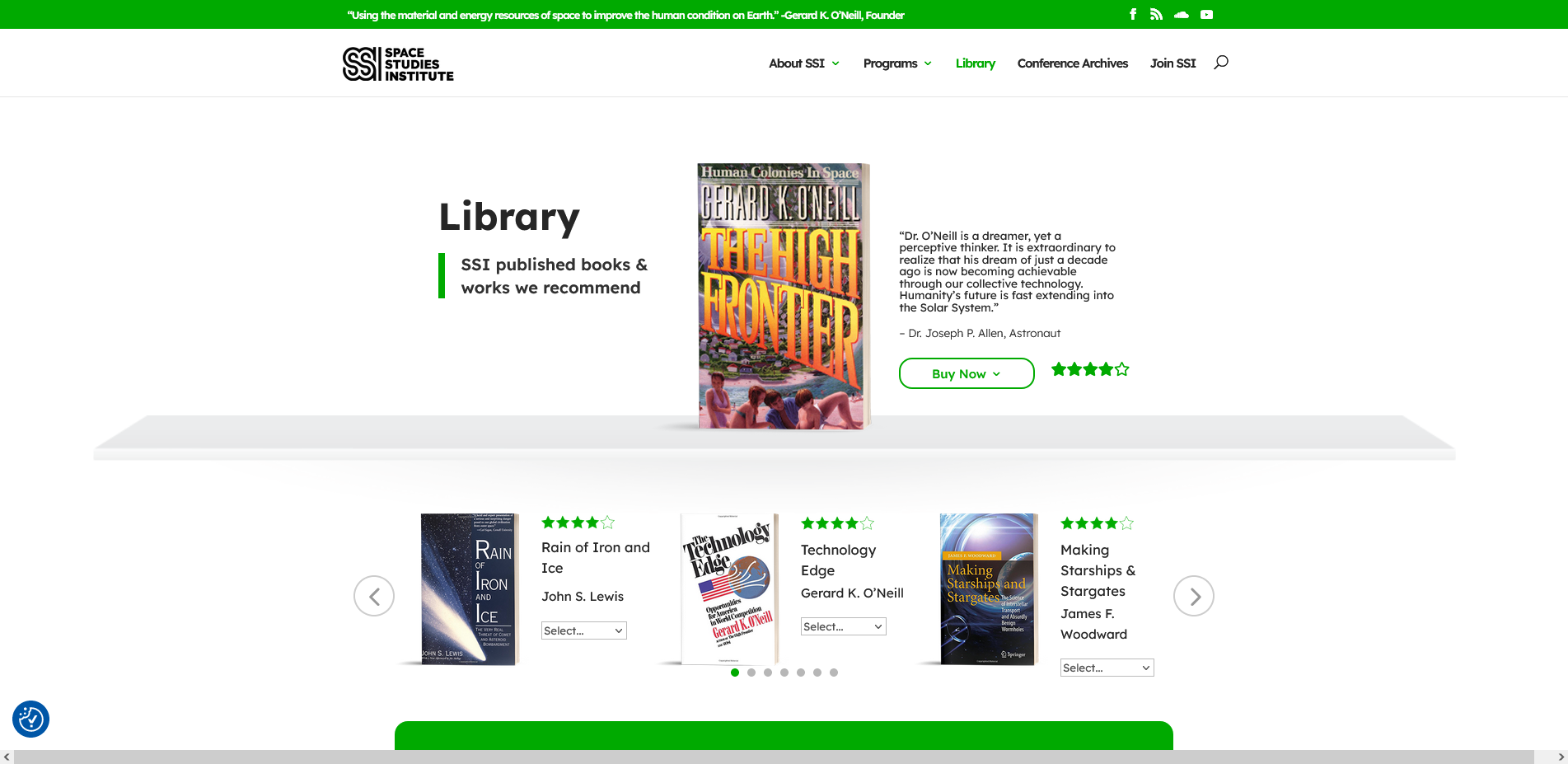
- Reviewed library metadata including ISBN, author, and value fields to inform content structure and archive strategy
-
02 Information Architecture
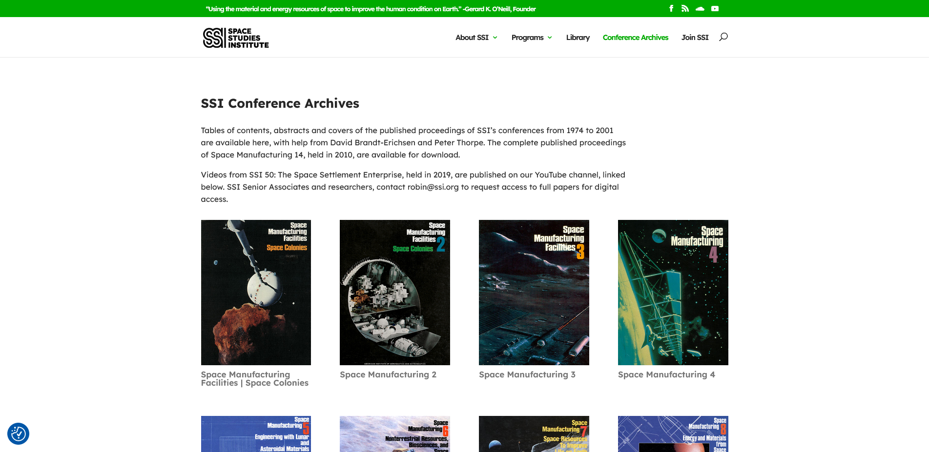
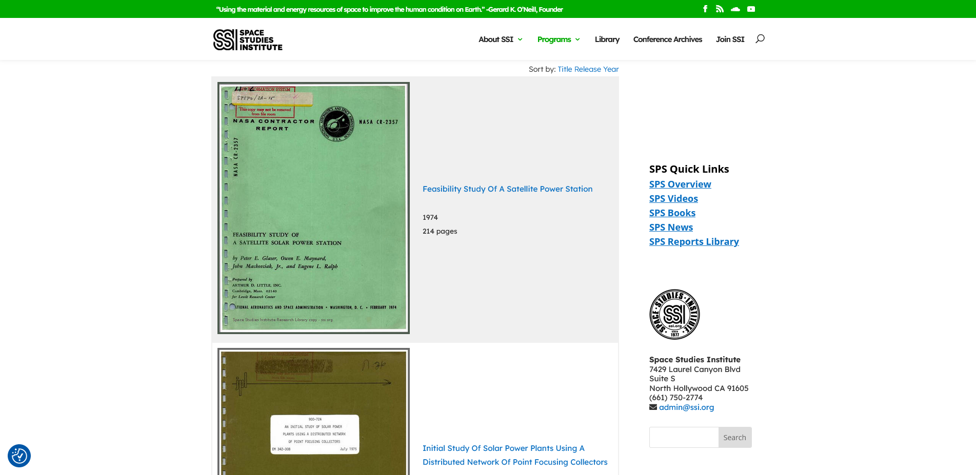
- Restructured navigation into clearer audience paths for research, donation, organization context, and archival material
- Mapped user flows for new visitors, researchers, donors, and returning SSI members
-
03 Wireframing & Prototyping
- Designed desktop and mobile wireframes around readability, hierarchy, and clear calls to action
- Refined layouts in Figma with special attention to font scale, visual weight, and scanning comfort
-
04 Usability Testing
- Tested prototypes with target users for navigation ease, content clarity, and donation flow comprehension
- Used feedback to tune copy, button prominence, homepage structure, and content grouping
-
05 Visual Design & Implementation
- Selected WordPress and Divi to support editing confidence for a small internal team
- Built templates, styled components, and page structures with Divi plus custom HTML/CSS
- Collaborated on CMS integration so stakeholders could maintain content without constant outside support
Results
Outcome & Vision
"Visitors mention how clean and easy the site feels now, especially compared to before."
SSI Client Feedback